There are common scenarios that you will encounter when creating content models and content types. This article assumes that you will be using a Content Management System (CMS) to manage the content on your site.
Some tips warrant their own articles. See the Naming Content Types and Consolidating Content Types articles for detailed recommendations.
This article is part of the Content Model Overview series.
For a more in-depth description of how content models are created see the Creating Content Models article.
For more details on content types see the Content Types article.
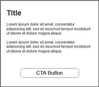
CMS title vs displayed title/heading
When creating content in your CMS there is typically a Title field included by default. In most cases, this field is for editors to enter a unique name that is displayed in the CMS admin pages. In many CMS platforms you are able to use this default title field in the display of your component. For example, you may use this title field as the Heading for your component. However, this will lead to an issue if you want any other component to use the same Heading as the title field typically needs to be unique. The recommendation is to create a new field specifically for the heading. This way you can have two different components that have the same heading.
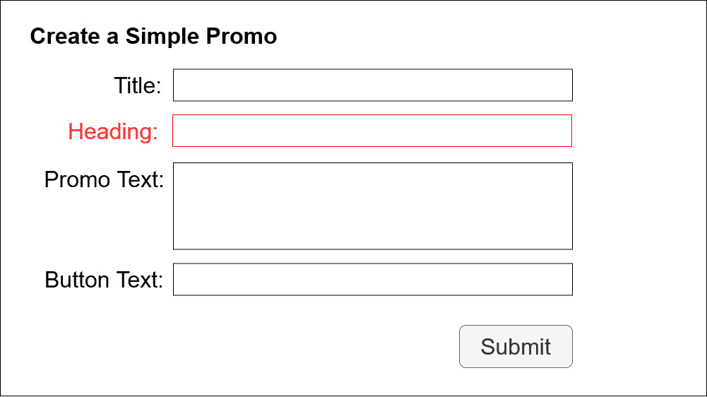
When you add the heading field you can now have two different components that use the same heading text while still having a unique title in the CMS. For example, we may want to have two versions of the Visit the Zoo promo with different promotional text. Both components will use the same headline, “Visit the Zoo.” In the CMS they can have different titles without affecting the display of the content.


Content type field validation rules
When creating your content model it is very common to add character counts or max limits to text elements. Copy writers and editors will want to know these rules when they create content. For example, we may have a component where the user experience team has made a recommendation of limiting the title element to 100 characters. In most Content Management Systems (CMS) we can add a validation rule on the Title field to enforce the 100 character limit. However, it is almost guaranteed that at some point a copy editor is going to want to use 101 characters (or more). So, when creating max character limits, it is often better to provide a general recommendation and not a hard validation rule in the system. The editor can preview the component before publishing to ensure that the title fits the space as intended.
Text wrapping and text length
Even with text length validation rules eventually you will run into a scenario where the text wraps to the next line. Similarly, you will encounter times text is longer than on the original design. When developing components you will need to ensure you account for these scenarios.
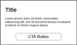
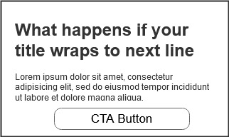
In the above example, the heading wraps to the next line causing the promo text to push down towards the button. If additional text is added to the header (assuming this is a fixed height component) the rest of the text may overlap the button. One solution is to allow the component to grow vertically as more text is added:
This example shows that the component has grown to accommodate additional promotional text in the component. The button is at a fixed distance from the bottom of the component, so as the text gets longer and component grows, the button stays correctly positioned at the bottom. This can be a good solution if your design allows for variable height components. However, it can also introduce a new issue. If the multiple components appear on the page in the same row they will not have a consistent height:
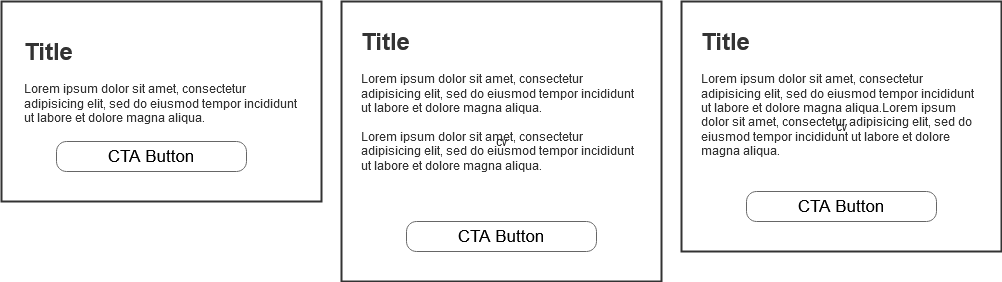
Since the height is variable, we now have components that do not match and cause white space (empty space) on the page. To complete the fix we need to ensure that the components are equal height when used in the same row:
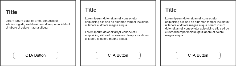
Image dimensions
When creating a content type that includes an image, it is recommended to include the required dimensions on the content type in your CMS. If you display the size requirements in your content type (in the field name or in the description) any future editor or designer will know what size image to use for that component.
Text over images
Many designs will incorporate a text heading on top of a background image. This is very common in Hero components, the large full width image, often with heading text, at the top of many web pages). Even if the initial design looks good and the text is easy to read, since we are using Content Management Systems you do not know what images will be used in the future. You can not rely on people cutting the perfect responsive images that don’t interfere with the readability of any text placed on top of the image. There are a few common solutions for this:
- Add an color overlay on top of the image that mutes the image so the text stands out and passes accessibility tests.
- Add a text shadow or glow that mutes the image just around the text to allow the text stands out and passes accessibility tests.
- Add a background color to the text container that can be a solid color so the text is readable.
- Move the text off of the image completely. In some designs the heading can be displayed below the hero image, potentially with it’s own design treatment.
Formatted text in headers and short text fields
Typically when creating a content type in a CMS you have three options for including text fields:
- Short Text: A single line text field for short text.
- Long Text: A multi line unformulated text area for long text.
- Rich Text or HTML text: A multi line text area with text formatting option toolbar (text editor field).
There are components where the design calls for a title or short description. Everyone will agree at this time that the title and short descriptions do not need any formatted text, links, bullets, etc. But, at some point an editor is going to want to include a link or format some text. For example, the title may refer to a product line that has a brand requirement to be italicized. When this occurs you only have a few options:
- Push back and tell the editors they can not use formatted text. If the editor is your marketing team or your client this typically does not work out.
- Change the text field type to a Rich Text field. The issue with rich text is that editors can do pretty much whatever they want and easily destroy the design. Many time we use short text or unformatted text fields to protect the design integrity. Rich text fields output HTML and are more complicated than simple text fields.
- Output raw HTML when rendering the simple text field. This option will allow editors to use HTML tags in-line with the text. For example, “Visit the <b>Zoo<b/>” would display with the word Zoo as bold. If you use this option you may want to build in validation or place restrictions on what can be entered.