This article assumes that you will be using a Content Management System (CMS) to create content types that will be used for creating the components on your site. There is often a balance you need to find between consolidating similar content types versus creating multiple unique components.
This article is part of the Content Model Overview series.
For basic information about content models see the Content Models article.
For more details on content types see the Content Types article.
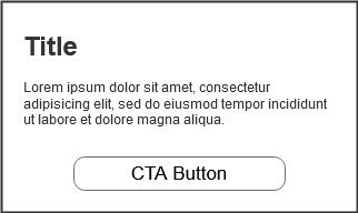
We will start again with our Simple Promo example, using the following basic wireframe. This content type will have a title, promotional text, and a CTA button.
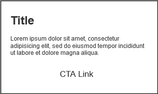
Our next component is very similar. Instead of a button, the UX team has decided this component will use a link instead of a button.
Here is our first decision point. The content models for these components are the same. The button and link are really the same markup (for our purposes we’ll assume the button is a link that is styled to look like a button). The only difference between the two is the visual difference between a link and button treatment. We can easily create two different components in our CMS:
- Simple Button Promo
- Simple Link Promo
The advantage of this strategy is that it is very clear to editors which component they are creating. A Simple Button Promo will always show up on the site using a button, a Simple Link Promo will always have a link. However, there are some disadvantages to this as well.
- You may find that you end up with too many components in your system. This makes choosing the correct component to use more difficult for editors.
- The more components you add to your system, the more unique and descriptive names you need to generate (see Naming Content Types).
- The same design or functional updates may need to be made multiple times to similar components. If you have four very similar components that you decide to update, you may need to make those updates to each component separately.
- The more components you have in your system requires higher maintenance efforts and cost in the long run. Similar to previous point, changes in templates or general site code will require more development and testing time.
For our two promos, it makes sense to consolidate these into a single content type. What we will need to provide is a new property that allows an editor to choose if the CTA should display as a button or as a link.
| Property Name | Type | Required | Validation Rules |
|---|---|---|---|
| Title | text | yes | maximum 75 characters |
| Promo text | text | yes | maximum 150 characters |
| CTA Type | radio buttons: -Button -Link | Yes | Default to button |
| CTA Text | text | yes | maximum 200 characters |
| CTA link | url | yes | If linking to internal page open in same window. If linking to external page open in new window. |
In our content model we added a CTA Type property that allows the editor to choose how the CTA is displayed.
When we are reviewing wireframes and designs we should be looking for opportunities for consolidation. Here is another example of similar components that we can consolidate into a single content type.
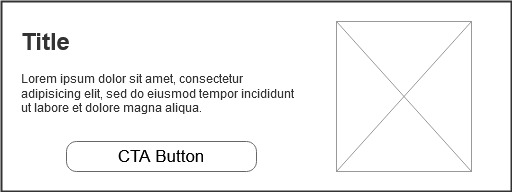
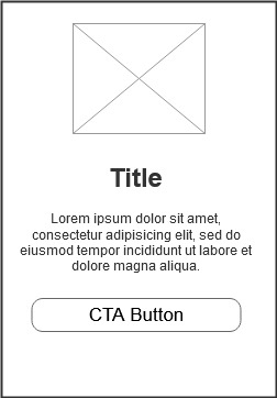
These two components share the same content model, a title, promotional text, cta button and an image. The only difference is the orientation of landscape vs portrait. Additionally, the only difference between these new components and the Simple Promo we defined above (other than the landscape vs portrait) is the addition of an image.
This presents the next set of decisions. Are these new components different enough from our original simple promo to justify a new content type? We could easily add an image element that is optional. However, there is a point at which a content type can become too complex and full of configurations. If an editor does not inherently know how that component will display on the page it is probably too complex. If an editor will need significant training or documentation in how to configure the components, again it is probably too complex.
We will create a new content type for a Simple Image Promo that allows for configuring the landscape vs portrait rendering:
| Property Name | Type | Required | Validation Rules |
|---|---|---|---|
| Display Orientation | Radio buttons: - Portrait - Landscape | yes | Default to Portrait |
| Image | 200x200 image | yes | jpg or png |
| Title | text | yes | maximum 75 characters |
| Promo text | text | yes | maximum 150 characters |
| Button label | text | yes | maximum 200 characters |
| Button link | url | yes | If linking to internal page open in same window. If linking to external page open in new window. |
For our last example we will look at two very similar content types that we may want to keep separate. On our site we have the following components:
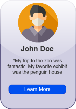
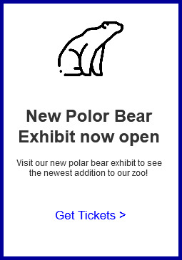
Both of these components share the same content model as the Simple Image Promo content type we defined. They have an image, title, some text, and a call to action button/link. The component on the left, however, is quite distinctly a testimonial component. The component on the right is a Simple Image Promo in portrait orientation. We could add another configuration to our Simple Image Promo to toggle between testimonial view and standard view. However, since the testimonial is a distinct component with a significantly different design and intent, the recommendation here would be to keep these content types separate.