For new website implementations, the first draft of the content model is typically created in some form during the define phase of the project. Some projects may have an actual deliverable document from a content strategist. In many cases, the initial content model is derived from the wireframes generated by the User Interface/Experience team and then updated as needed during design and development.
This article is part of the Content Model Overview series.
For basic information about content models see the Content Models article.
For more details on content types see the Content Types article.
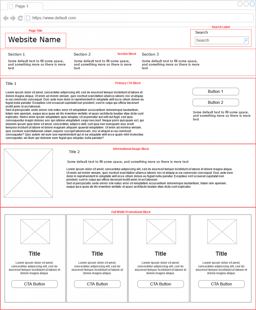
For our purposes, we will start creating a content model based on a the following wireframe. A wireframe outlines the basic structure, layout, and components of a webpage.

When creating a content model, we are identifying the unique components that need to be created and the content/data required to display them. These unique components are called Content Types. The homepage wireframe has several components, but we can start with the page itself. Here is a very basic content model that identifies some page specific properties as well as the unique components that are required:
- Page Title
- Search Label
- Section List
- Primary Call to Action Block
- Informational Image Block
- Full Width Promotional Block
This annotated wireframe will help illustrate the fields and components we identified in our content model. You will notice we only identified the top level components of the page. Each sub-component will have it’s own content type definition.
So far our Homepage content type is vary basic and does not contain all of the information we need to build the page. We can start adding additional attributes and rules to our content model.
Homepage content type
Here we’ve created a table that documents each property of the Homepage, the type (text, image, component etc), if it is required as well as additional validation rules. We will use this table format for the rest of the content types as well.
| Property Name | Type | Required | Validation Rules |
|---|---|---|---|
| Page Title | text | yes | max length 50 characters |
| Search Label | text | yes | max length 10 characters |
| Primary CTA Block | component | yes | |
| Informational Image Block | component | yes | |
| Full Width Promo Block | component | yes |
Section Block content type
For the Section Block component, we could decide that each section heading and text pairing was it’s own unique content type since it is repeated on the page. For now we will just include each as a separate property.
| Property Name | Type | Required | Validation Rules |
|---|---|---|---|
| Section 1 Heading | text | yes | max length 30 characters |
| Section 1 Text | text | yes | max length 100 characters |
| Section 2 Heading | text | yes | max length 30 characters |
| Section 2 Text | text | yes | max length 100 characters |
| Section 3 Heading | text | yes | max length 30 characters |
| Section 3 Text | text | yes | max length 100 characters |
Primary CTA Block content type
The Primary CTA block introduces the use of buttons as one of the component properties. In our content type we have two rows for a button, one for the button label and one for the URL where the user is taken if they click the button.
| Property Name | Type | Required | Validation Rules |
|---|---|---|---|
| Title | text | yes | max length 300 characters |
| CTA Primary Text | text | yes | max length 2000 characters |
| Button 1 Label | text | yes | max length 200 characters |
| Button 1 Link | Url | yes | If linking to internal page open in same window. If linking to external page open in new window. |
| Button 2 Label | text | no | max length 200 characters |
| Button 2 Link | Url | no | If linking to internal page open in same window. If linking to external page open in new window. |
| CTA Secondary Text | text | no | max length 300 characters |
Informational Image Block content type
The information Image Block includes an image. In our content model we will include the dimensions expected for the image. WIth this knowledge a designer can start creating or looking for images to use with this component.
| Property Name | Type | Required | Validation Rules |
|---|---|---|---|
| Image | 300x300 image | yes | .jpg or .png format |
| Title | text | yes | max length 300 characters |
| Sub title | text | yes | max length 500 characters |
| Primary Text | text | yes | max length 1000 characters |
Full Width Promotional Block content type
The Full Width Promotional Block is a container for displaying Simple Image CTA promos. If we isolate this component in the wireframe, we can see that the Simple Image CTA Promo is repeated inside of this parent component.

The content model for the Full Width Promotional Block contains a reference or relationship to the Simple Image Promo content type.
| Property Name | Type | Required | Validation Rules |
|---|---|---|---|
| Simple Image CTA Promo | Component | yes | Allows for 3 - 4 simple image promos to display. If only 3 simple image promos are selected, center the content. |
Simple Image CTA Promo content type
The Simple Image CTA Promo contains several of the properties we used on our other components. It defines an image with dimensions, text, and a button with both the label and link url.
| Property Name | Type | Required | Validation Rules |
|---|---|---|---|
| Image | 200x200 image | yes | |
| Title | text | yes | maximum 75 characters |
| Promo text | text | yes | maximum 150 characters |
| Button label | text | yes | maximum 200 characters |
| Button link | url | yes | If linking to internal page open in same window. If linking to external page open in new window. |